
Belgium - Breweries
Grimbergen Brewery
Click on a beer glass for more information
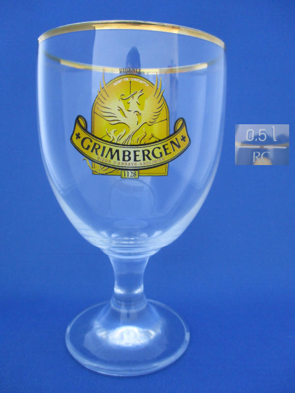
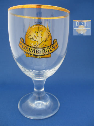
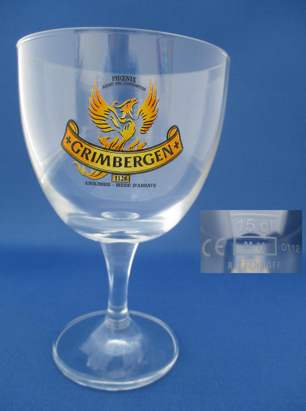
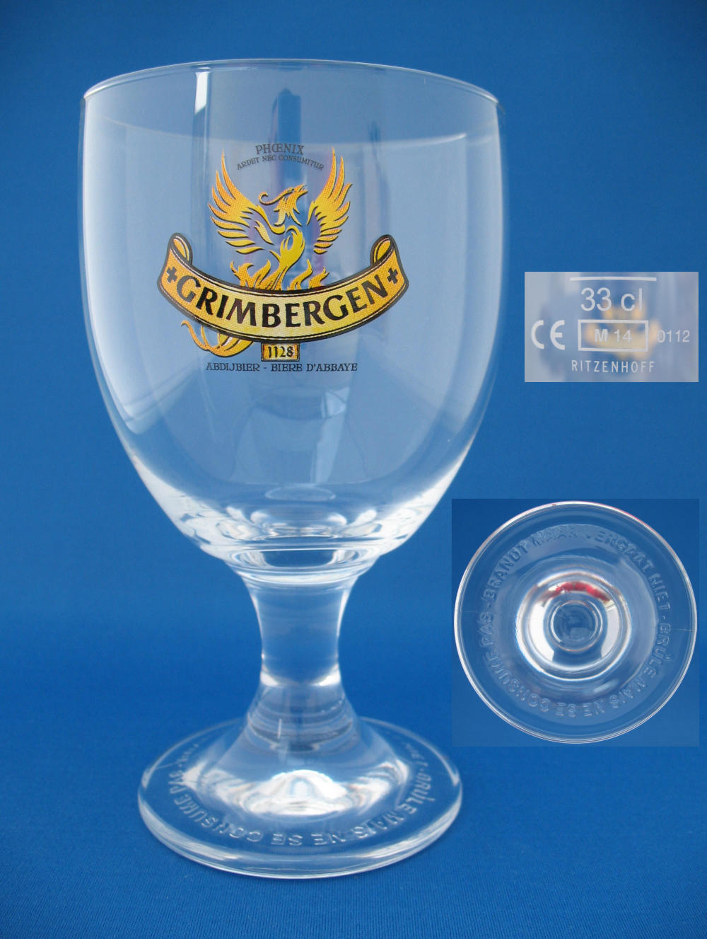
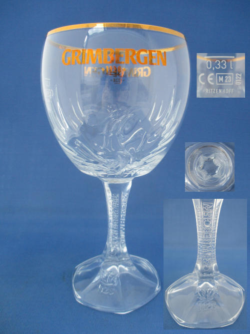
Additional Information
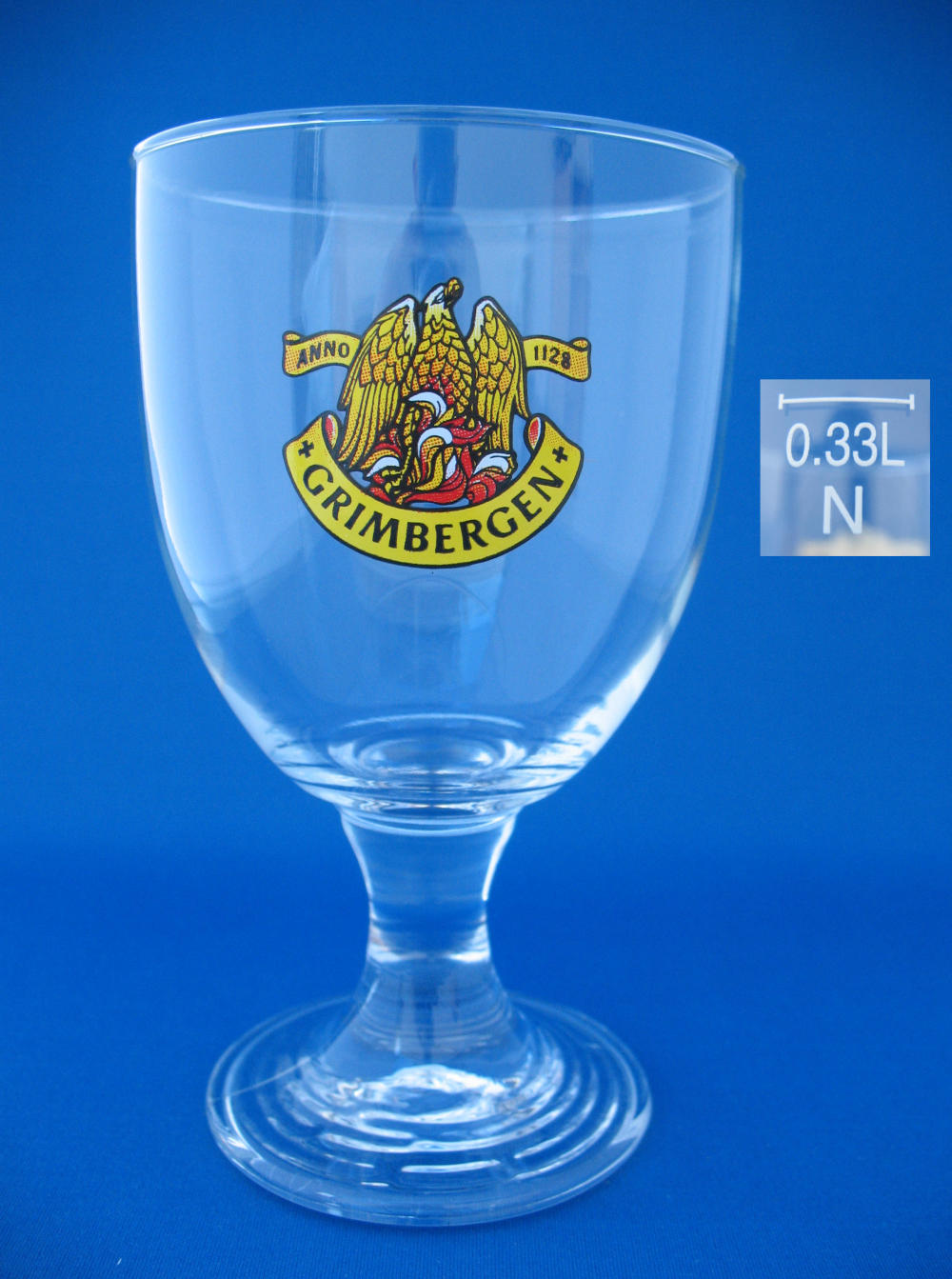
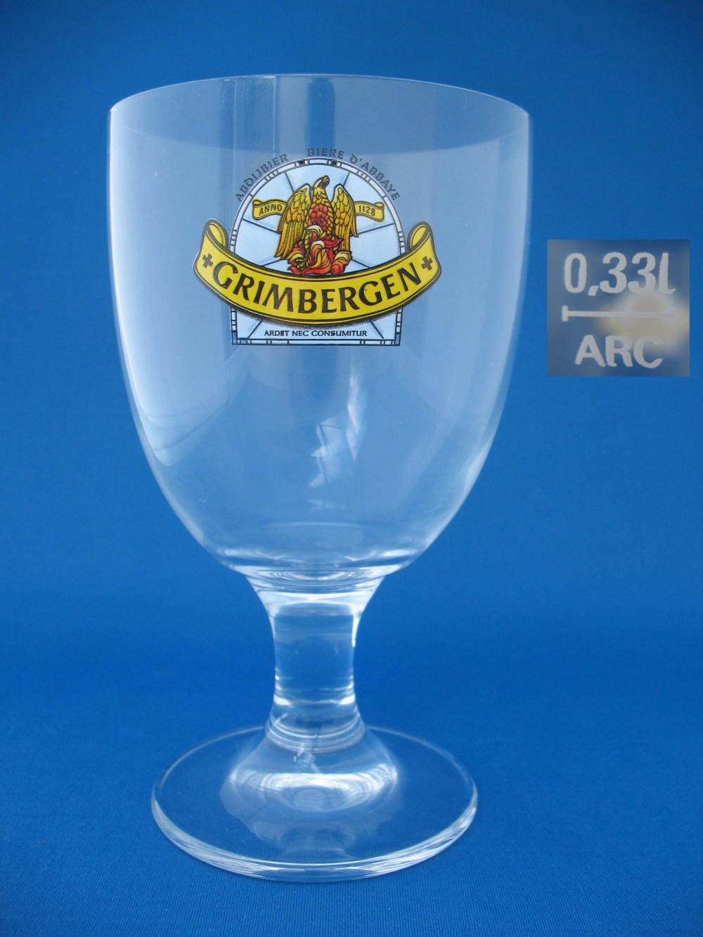
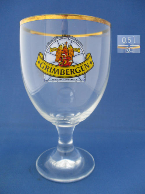
In the year 1128 St. Norbert built in the Brabant town of Grimbergen an abbey for the monastic order of Norbertine . In addition to the religious duties the order mastered the art of brewing. The Grimbergen logo was always a phoenix . In late 2010 the label was renewed in depth: the phoenix came more to the fore and was modernized. At the top is the label: "Phoenix" and below "Ardet nec consumitur". This means "lit but does not perish." This is the slogan of the abbey and refers to the many times that the abbey has been on fire, after which she was still always rebuilt and survived. They rose so every time a phoenix.
Some of the Brewery's Range
Grimbergen Blonde -
Grimbergen Double-Ambrée -
Grimbergen Blanche -
Grimbergen Rouge -
Grimbergen Noël -
Over the years the brand identity is updated and re-launched with subtle changes, a change of Logo or a new font.
Sometimes this brand update is done by the new owners after a brewery has been sold, other times just to give the brand a fresh new look on the ever growing market.
Below are some notes to help identify some of these changes and an aid to reference the year of the glass.
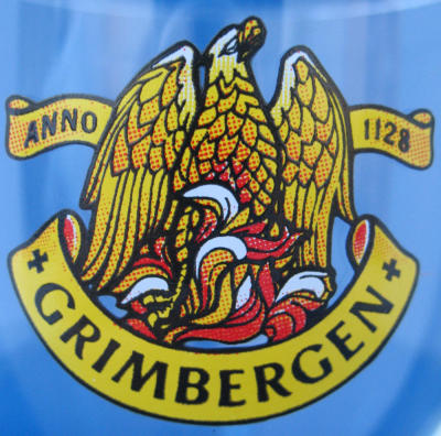
Logo
1990's
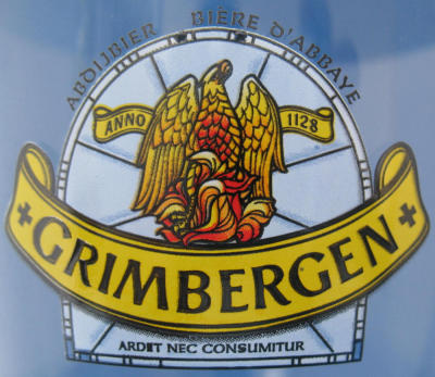
Logo
2000 to 2010
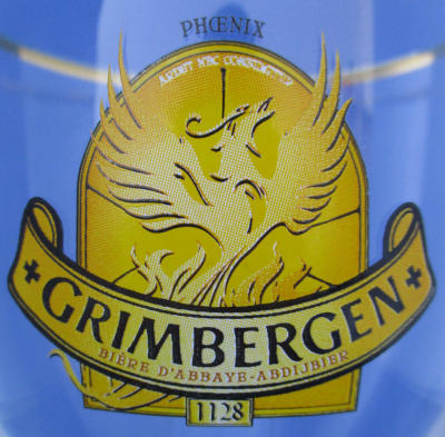
Logo
2010
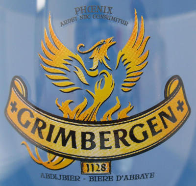
Logo
2011 to 2016
(2014 shown)